
08/23 Jeffery Keedy: Keedy Sans 1991
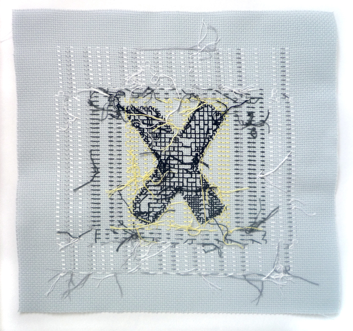
 Keedy Sans Regular lower case “x”, 25 x 25 cm.
I wanted a typeface that was similar to Cooper Black, extremely bold with a strong idiosyncratic personality.”
Cooper Black used to be a typeface not mentioned when talking about good design. In 2002 when Jeffrey Keedy wrote the text for the specimen booklet for Keedy Sans, Cooper Black was on a “black list”.
But the fonts that we use reflect the culture of our time. A few weeks ago I saw a Finnish tabloid newspaper with Cooper Black headlines, and I was attracted, to my own surprise. How could Cooper Black look so… fresh?
Keedy Sans was born with the name Bondage Bold for Jeffrey Keedy’s own user/designer needs. He had previously used American highway Gothic typeface, which he cut and pasted from a highway signage manual. He designed a typeface that would wilfully contradict the familiar expectations:
Most typefaces are logically systematic; if you see a few letters you can pretty much guess what the rest of the font will look like.”
As P.Scott Makela, who designed his Dead History in the same year, Keedy was eager to embrace the computer as a tool. In those days the selection of digital typefaces was limited and new typefaces weren’t born with the same frequency as nowadays.
So the only way to get the right feeling for the typeface was to design them by yourself.
Keedy Sans shares the same attitude with Dead History: they were designed to celebrate their experimental nature with letterforms that are intentionally unfinished and imperfect. Both typefaces were also deeply connected with the postmodern with “a typically postmodern strategy for a work to call attention to the flaws and artifice of its own construction,” says Keedy.
I think it is a very postmodern typeface in that it included “high” and “low” vernacular quotation, and it is self-consciously crude and anti-aesthetic in reaction to the slickness of Modernism.“
The initial reaction to Keedy Sans was that it was “ugly,” hard to read, and too weird to be useful. It was first used in layouts for Emigre magazine and despite all the criticism it soon became popular among designers.
When you look at the typeface now, it is obviuos that it is a type of its time: experimental, questioning, decorative and oh, so postmodern.
http://www.moma.org/collection/object.php?object_id=139318
http://www.eyemagazine.com/feature/article/remove-specifics-and-convert-to-ambiguities
http://www.emigre.com/EFfeature.php?di=100
Part IV: 05/23 Tobias Frere-Jones: Interstate 1993-95

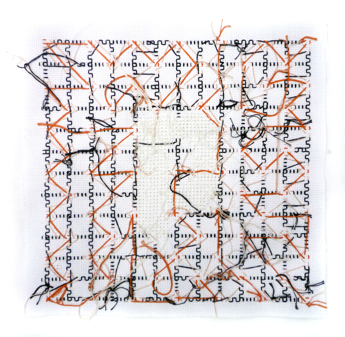 Interstate Black lower case “q”, 25 x 25 cm.
This is the last part of the Interstate story. I chose to stitch different weights to see how it would effect the cross stitching. The background patterns are intuitive and dictatorial choices. Only one of them is a ready pattern, others are either modified or designed by me.
x x x
Interstate is a truly inspiring typeface classic. If you ask a second year graphic design student to tell the origins and story plus identify Interstate, they can do it.
It is a sans-serif neo-grotesk typeface designed by Tobias Frere-Jones in 1993-1995. The letterforms are based “on the font colloquially known as Highway Gothic, the official typeface of the American Federal Highway Administration, designed by Ted Forbes in 1949.” http://www.moma.org/collection/object.php?object_id=139305
Frere-Jones designed Interstate carefully as homage to Highway Gothic, which in his opinion is “very American in that way—just smash it together and get it up there”.
He managed to bring Interstate a familiar and recognizable feel of the aesthetic of the American road.
x x x

Take a closer look at the lower case t or l. You see that the terminals of ascending strokes are cut at an angle to the stroke. But if you compare lower case l and Upper case I, that often have the same shape, you see that whereas the lower case ascender has an angle in the terminal, the upper case is straight 90 degrees. Also on curved strokes, lower case e and s, the terminals are drawn at a 90° angle to the stroke.
Interstate is designed to be suitable for signage use, but also text setting in print and on-screen. In the Font Bureaus site it is recommended for “Newspaper, Magazine, Book, Web and Corporate use.”
Interstate was listed as the 14th best typeface of all time in the Big Font Ranking. No wonder! It was really popular in the 90’s and still is. http://www.100besttypefaces.com/14_Interstate.html
If you wan’t to know more of this digital classic, there is quite a comprehensive typography project done by Indian graphic design student Amrita. http://issuu.com/amritamayuri/docs/interstate_issuu?mode=window&pageNumber=1

Recent Comments